Exploring Accessibility and Digital Inclusion with Flutter
Flutter and its features can bring a wide variety of possibilities to digital products while generating accessibility for every user. Here we will learn how through Flutter's comprehensive and intuitive tools, developers are empowered to integrate accessibility seamlessly into their applications.
What is Digital Accessibility?
Accessibility is the practice of making software usable for people with disabilities. It enables them to perceive, understand, navigate, and interact with software, allowing them to be active and contributing members of the digital world.
Why is it important to be aware of accessibility?
According to the World Health Organization (WHO), an estimated 1.3 billion people experience permanent disability. This represents 16% of the world's population or, in other words, one in six of us. This number is very significant: When creating a new application, it's important to consider whether people with disabilities will be able to use your product or if they will face difficulties.
Some examples of permanent disabilities are:
- Loss of motion or strength in a body part
- Loss of Hearing or sight
- Loss of limb
Additionally, temporary disabilities can affect how the user interacts with the product over a period of time, so we must be careful with these cases as well.
Some examples of temporary disabilities are:
- Broken bones
- Back/neck injury
- Surgery rehabilitation
Technology teams should care about creating products for everybody, regardless of whether they have disabilities or not, which they can use and enjoy.
About WCAG 2.1
The Web Content Accessibility Guidelines (WCAG) 2.1 are guidelines for making web content more accessible. This allows users with disabilities to use these products by including accommodations for blindness and low vision, deafness and hearing loss, limited movement, speech disabilities, photosensitivity, learning disabilities, cognitive limitations, etc.
To follow these guidelines, applications should be:
- Perceivable: The information and components of the user interface must be presentable to users in a way that they can perceive them.
- Operable: User interface components and navigation must be viable.
- Understandable: Information and the operation of the user interface must be understandable.
- Robust: Content must be robust enough that it can be interpreted by a wide variety of user agents, including assistive technologies.
Conformance Level
These guidelines are differentiated into the following levels:
Level A (basic accessibility): The least strict. If your product does not pass this level you have a big accessibility problem that must be solved. At this level, there are 30 criteria that the product must meet, for example:
- Non-text content (images and videos) must have a text equivalent.
- Forms must include labels or instructions.
- Assistive technologies, such as screen readers, must be able to access content.
- The information must not be conveyed through shape, size, or color alone.
Level AA (Strong Accessibility): This is the recommended conformance level. At this level, the content of the product would satisfy all the criteria between Level A and Level AA. Some examples at Level AA are:
- Elements that affect navigation should be consistent across the site.
- Content should be organized on headings - this will be very important when the user uses the screen reader.
- The visual presentation of text and images of text has a contrast ratio of at least 4.5:1, except for the following:
Large Text
- Large-scale text and images of large-scale text have a contrast ratio of at least 3:1.
Incidental
- Text or images of text that are part of an inactive user interface component, that are pure decoration, that are not visible to anyone, or that are part of a picture that contains significant other visual content, have no contrast requirement.
Logotypes
- Text that is part of a logo or brand name has no contrast requirement.
Level AAA, the highest level of accessibility: This is the highest level to meet in our product, but this level is quite difficult to meet in all products, depending on different factors like budget, time, etc. Of course, you can implement some of them even if you don't fully meet the level AAA, everything counts. Some examples are:
- The contrast ratio between text and background is at least 7 to 1.
- Extended audio descriptions should be provided for pre-recorded videos.
For more information and all the different levels' criteria, please visit the WCAG 2.1 documentation.
What does Flutter say in its official documentation?
Flutter is very aware of accessibility, so it provides developers with good documentation to help us understand what is needed to implement accessibility (a11y) in our applications, and how to do it, and also provides us with a checklist so we can know if we are meeting the criteria.
Accessibility release checklist
Here is a non-exhaustive list of things to consider as you prepare your app for release:
- Active interactions: Ensure that all active interactions do something. Any button that can be pushed should do something when pushed. For example, if you have a no-op callback for an onPressed event, change it to show a SnackBar on the screen explaining which control you just pushed.
- Screen reader testing: The screen reader should be able to describe all controls on the page when you tap on them, and the descriptions should be intelligible. Test your app with TalkBack (Android) and VoiceOver (iOS).
- Contrast ratios: The contrast ratio should be at least 4.5:1 between controls or text and the background, except for disabled components. Images should also be vetted for sufficient contrast.
- Context switching: Nothing should change the user’s context automatically while typing in information. Generally, the widgets should avoid changing the user’s context without some sort of confirmation action.
- Tappable targets: All tappable targets should be at least 48x48 pixels.
- Errors: Important actions should be able to be undone. In fields that show errors, suggest a correction if possible.
- Color vision deficiency testing: Controls should be usable and legible in colorblind and grayscale modes.
- Scale factors: The UI should remain legible and usable at very large scale factors for text size and display scaling.
Large fonts
We need to ensure the layout has enough space to render all of its content when the font size is increased. In Flutter, text size calculations are handled automatically, but for example, the icon size is not handled automatically so I created an AppIcon widget that adapts to the current font size.
As you can see in the example, we need to use textScaleFactor from MediaQuery to scale based on the fontSize.
If you want to know more about textScaleFactor , this is an interesting article you can check out.
Code sample to change textScaleFactor
Demo font scaling

Screen readers
These are tools that allow visually impaired users to receive spoken feedback on-screen content and interact with the user interface using gestures on mobile and keyboard shortcuts on desktop. There are different types depending on the device the user is using:
- Android: TalkBack.
- iPhone: VoiceOver.
- Browsers:
- Mobile browser: VoiceOver or TalkBack.
- Desktop browser: VoiceOver or JAWs & NVDA.
- Desktop: VoiceOver or JAWs & NVDA.
Sufficient contrast
Sufficient contrast is useful for users with various visual impairments when viewing the interface on devices in extreme lighting conditions, such as direct sunlight, because it makes text and images easier to read.
The W3C recommends:
- At least 4.5:1 for small text (below 18 point regular or 14 point bold).
- At least 3.0:1 for large text (18 points and above regular or 14 points and above bold).
How to Implement Accessibility in Flutter
Implementing a11y in Flutter is easy. It is recommended to implement it from the beginning of the application because it will be easier, but if you can't, don't worry, you can also do it later.
Flutter widgets generate an accessibility tree automatically. However, if your app needs something different, you can customize it using the Semantics widget. This widget annotates the widget tree with a description of what the widgets mean.
Let's do an example of using semantic widgets. This example has been tested on a real Android device. Remember it is important to use real devices instead of simulators to test accessibility.
There are some widgets that you can use to add accessibility to your application. It will depend on what you need at all times, some of them are:
- Semantics: is a widget that annotates the widget tree with a description of the meaning of the widgets. This widget has a lot of properties, you can check them here.
In this example, we are using the Semantic widget to add accessibility to an ItemFavoriteButton widget. In this case, we are using some properties of this widget such as:
- Button: It represents a button in this subtree.
- Label: Provides a description of the widget.
- Selected: It indicates that this subtree represents a widget that can be selected/unselected.
- onTap: handler for the SemanticsAction.onTap operation. It can be triggered by double-tapping in VoiceOver or TalkBack.
- onTapHint: the hint of the onTap action.
In the following example of the ItemCard widget we will see more types of widgets that we can use to add accessibility to your application:
- MergeSemantics: This widget is very useful with screen readers because it allows you to stack other widgets together and read them all at once; In more technical words, it is a widget that marks a subtree as a single node for accessibility purposes.
- IndexedSemantics: Creates a widget that annotates the first child semantics node with an index. Semantic indexes are used by TalkBack/Voiceover to make announcements about the current scroll state.
- ExcludeSemantics: This widget will exclude your child's reading when using screen readers.
Also, some of the Material widgets have properties to help simply implement a11y, for example with semanticsLabel on the Text or Image widgets.
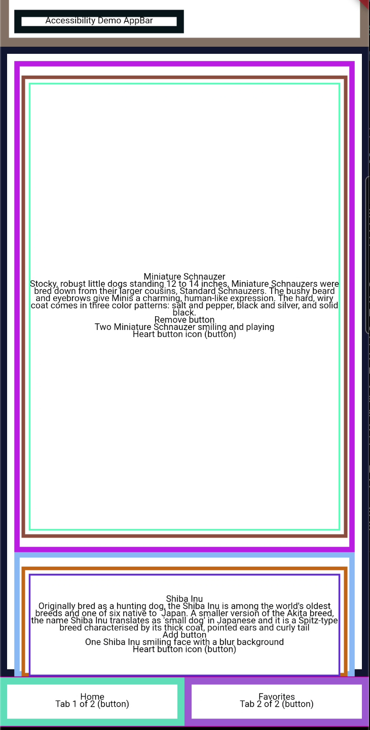
Demo with TalkBack (screen reader on Android)
If you would like to see the demo and hear how TalkBack helps the user identify the different parts of the application, visit the project readme file here.
Test your Semantics widgets
Here we are going to learn how to test a widget that uses semantics and also check if this widget meets the guidelines to be an accessible widget:
- androidTapTargetGuideline, which checks that tappable nodes have a minimum size of 48 by 48 pixels.
- iOSTapTargetGuideline, which checks that tappable nodes have a minimum size of 44 by 44 pixels.
- textContrastGuideline, which provides guidance for text contrast requirements specified by WCAG.
- labeledTapTargetGuideline, which enforces that all nodes with a tap or long press action also have a label.
In this case, we are going to test the ItemFavoriteButton that I added earlier in the example.
First, we need to check if the widget meets the guidelines:
Then we need to check if the widget matches the semantics:
As you can see, you need to use a tester.ensureSemantics, it is required to call to dispose method at the end of the test.
To test the onTap property in the semantic widget, you need to use the performAction and SemanticsAction.tap, you can see the example below.
Check your semantic widgets with the debugger
If you want to visually check how your semantic widgets are working, you can use the showSemanticsDebugger property on your MaterialApp widget.
This is the result.
Accessibility example app - Github
You can check the full example here.
Interesting resources about accessibility
Talks
- Building in Accessibility with Flutter - Google devs - Flutter Interact '19
- Stop treating accessibility as an afterthought: concrete steps to build inclusive apps - Manuela Sakura Rommel - FlutterCon ‘23
- Accessibility features and how to implement them in Flutter – M. Wróblewski - MonteTalks: Mobile
- Accessibility in Flutter - Lara Martín & Miguel Beltran - Skills Matter
Articles
- A deep dive into Flutter’s accessibility widgets - Muhammed Salih Guler
- Flutter: Crafting a great experience for screen readers - Shawn Blais
- Material Documentation: Understand accessibility
- European Accessibility Act
- United Nations: Article 9 - Accessibility
- Mobile Experiences For Businesses: How To Boost Accessibility And Revenue - Vincent Phamvan - Forbes Council Member
This is just an example of how to start implementing accessibility in a Flutter application, there are more things to consider to meet at least Level AA conformance.
Insights from Our Experts
Loyalty is a Product, Not a Program: How Modern Brands Build Habit-Forming Engagement
Lorem ipsum dolor sit amet, consectetur adipiscing elit. Suspendisse varius enim in eros elementum tristique. Duis cursus, mi quis viverra ornare, eros dolor interdum nulla, ut commodo diam libero vitae erat. Aenean faucibus nibh et justo cursus id rutrum lorem imperdiet. Nunc ut sem vitae risus tristique posuere.

Braze Intelligence Isn’t Hype—It’s a Performance Multiplier Humans Can’t Compete With
Lorem ipsum dolor sit amet, consectetur adipiscing elit. Suspendisse varius enim in eros elementum tristique. Duis cursus, mi quis viverra ornare, eros dolor interdum nulla, ut commodo diam libero vitae erat. Aenean faucibus nibh et justo cursus id rutrum lorem imperdiet. Nunc ut sem vitae risus tristique posuere.
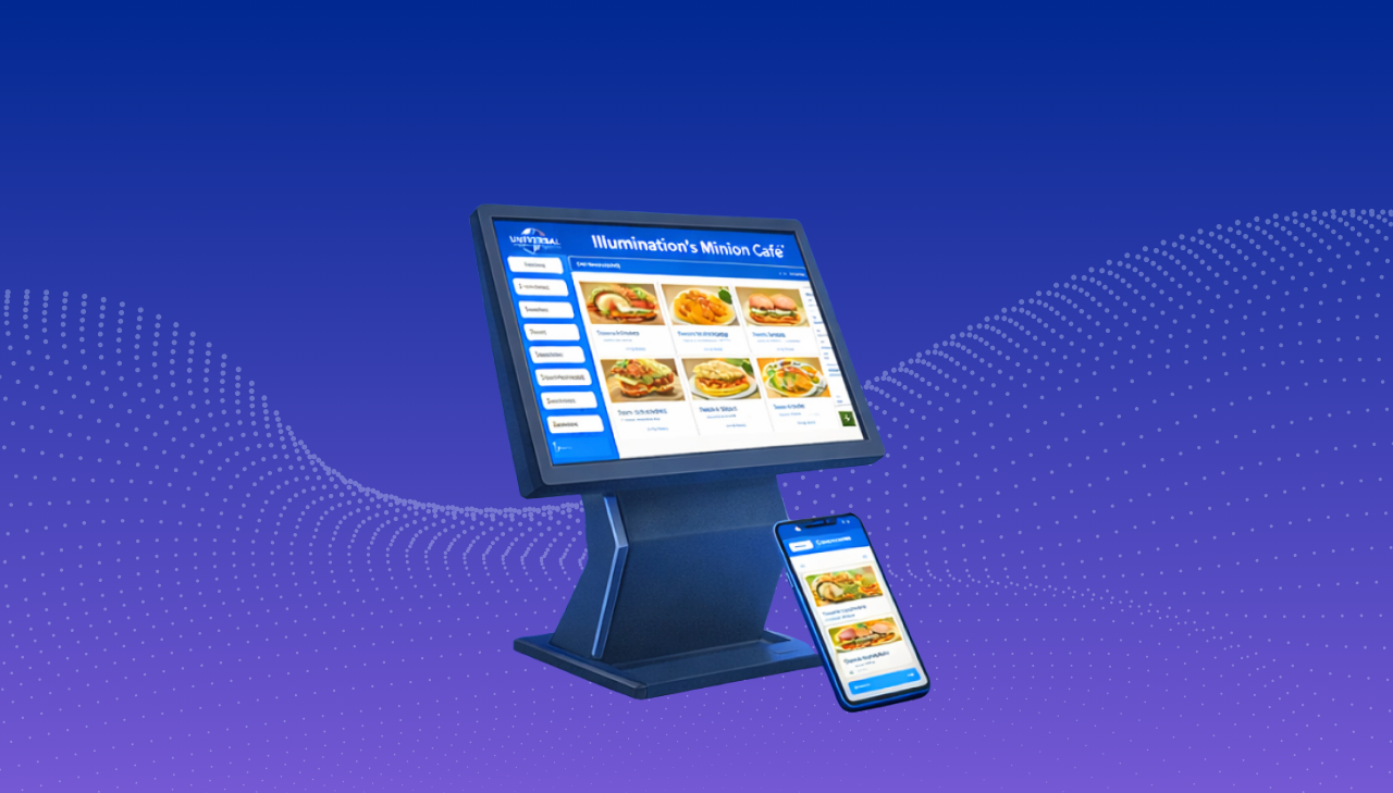
Mobile Ordering That Works in the Real World: Scalable Flutter Solutions for Theme Parks, QSR, Cruise Lines & Entertainment Venues
Lorem ipsum dolor sit amet, consectetur adipiscing elit. Suspendisse varius enim in eros elementum tristique. Duis cursus, mi quis viverra ornare, eros dolor interdum nulla, ut commodo diam libero vitae erat. Aenean faucibus nibh et justo cursus id rutrum lorem imperdiet. Nunc ut sem vitae risus tristique posuere.
