This year, I had the amazing opportunity to share my insights on how to build robust and maintainable design systems for custom widgets at Fluttercon USA in New York, and FlutterConf Latam in Quito, Ecuador.
I wanted to bring these sessions to a broader audience through this blog, to both make this sometimes complex and confusing topic easier to understand, and to highlight practical ways to approach design systems in Flutter.
What is Theming?
Theming is the process of defining your app’s visual identity, which dictates the stylistic aspects of your UI (such as typography, color, and sizing). Crucially, theming doesn’t impact functionality, creating a clear separation between how something looks and how it behaves.
Think of it this way: Instead of hardcoding visual properties into every single widget, you define them once, centrally. Then, widgets throughout your app can simply reference those defined styles.
Theming isn’t just a cosmetic choice; it’s a foundational aspect of app development that ensures visual harmony and a consistent user experience.
Separating Style From Behavior
Let’s illustrate this concept with a common UI element: a button.
A button inherently has two fundamental aspects: how it looks (its style) and how it behaves (its functionality when interacted with).
Imagine a button styled with a distinct color, rounded corners, and clear text. When pressed, it displays a snackbar, showcasing both style and behavior working in tandem.
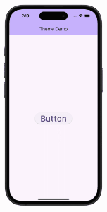
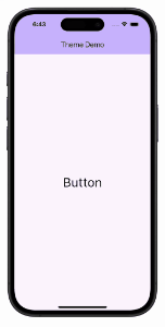
Now, consider a plain text button with no fancy styling. If it still shows the snackbar when pressed, it demonstrates that behavior can exist independently of style. The core functionality remains, even without visual appeal.
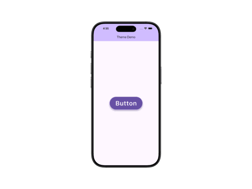
Conversely, imagine a meticulously styled button with a rich purplish background, crisp text, generous padding, and beautifully rounded corners. It looks fantastic! However, if clicking it does nothing, it proves that style can exist completely separate from behavior. You can invest all your effort into making a component look perfect, but without defined actions, it remains a static visual element.
In summary, theming consistently defines and applies the “look” of your UI components across your entire application, allowing their ‘behavior’ to remain independent.
Theming Your Custom Widgets
Flutter offers two built-in theming systems: Cupertino and Material. However, only the Material system provides a structured way to extend and customize themes, which is what we’ll build upon.
As you may know, MaterialApp automatically applies theming to all descendant widgets. This works seamlessly with Material widgets because their properties are wired into the theme system by default.
But what about your custom widgets? How can you define reusable styles for them while keeping your UI clean and maintainable?
In this guide, we’ll explore how to bring Material’s theming approach to your own components, creating a consistent and scalable design system across your app.
Simple Widget Styling
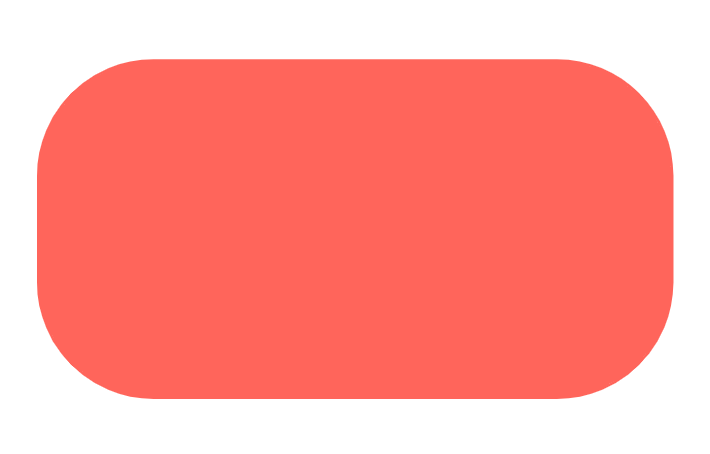
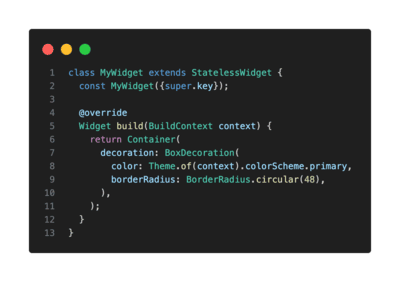
For a simple custom widget with minimal styling, you can easily style it directly inline. You might get colors from the ColorScheme and set a specific borderRadius for the widget. This approach works well when your widget has only one style and its styling is minimal.
Handling Multiple Styles: Encapsulate in a Class
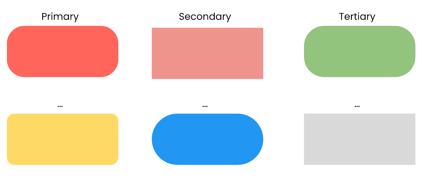
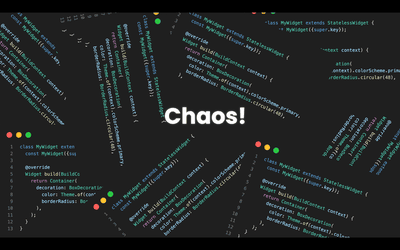
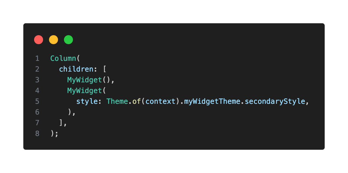
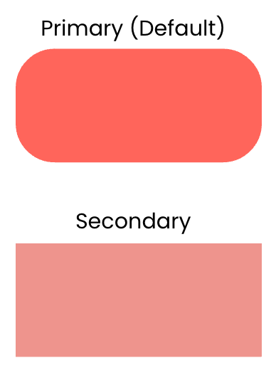
What if your custom widget needs distinct visual “variants” (e.g. a “primary” and a “secondary” style)? Hardcoding these different styles directly into multiple widget instances can quickly lead to chaos and an unmaintainable codebase.
Instead, when a custom widget requires distinct visual variants, I recommend encapsulating style-related properties in a dedicated class. This clearly separates the concerns between the widget’s dynamic style (themable appearance) and its other non-stylistic members.
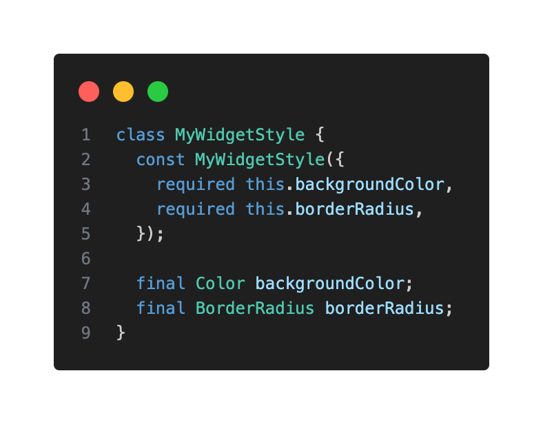
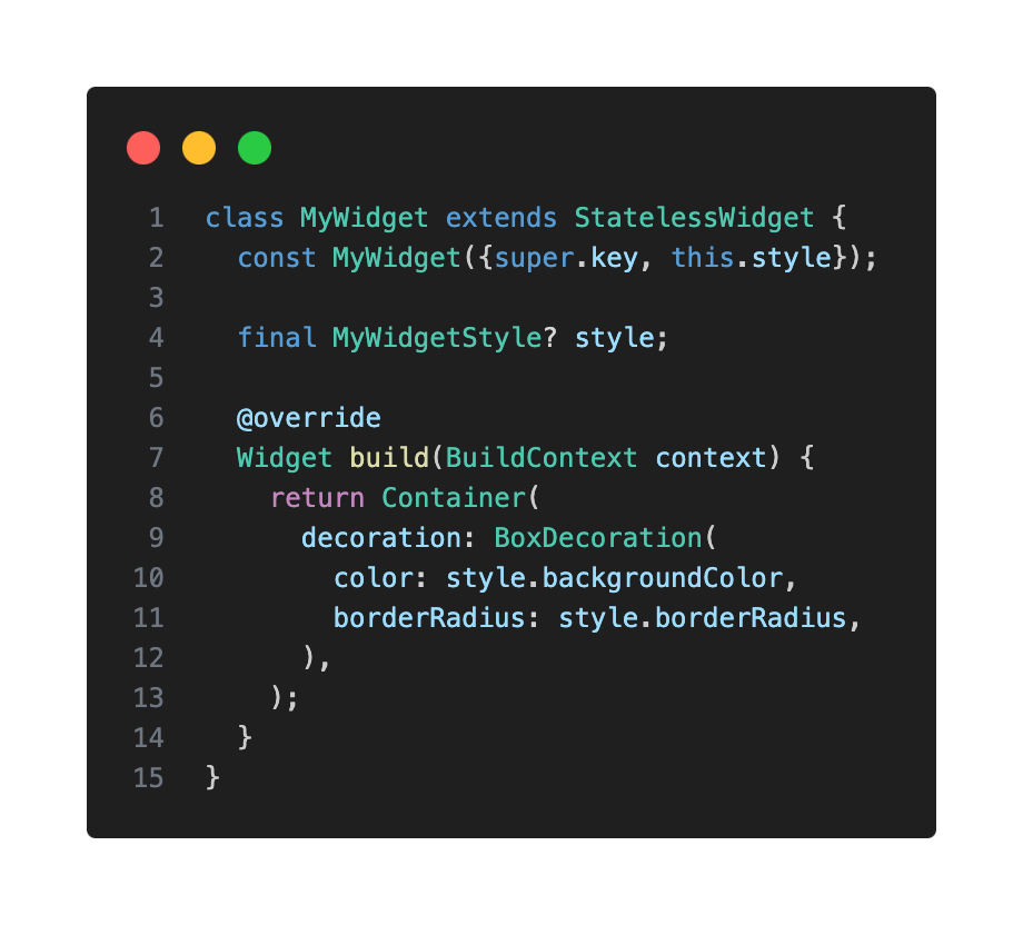
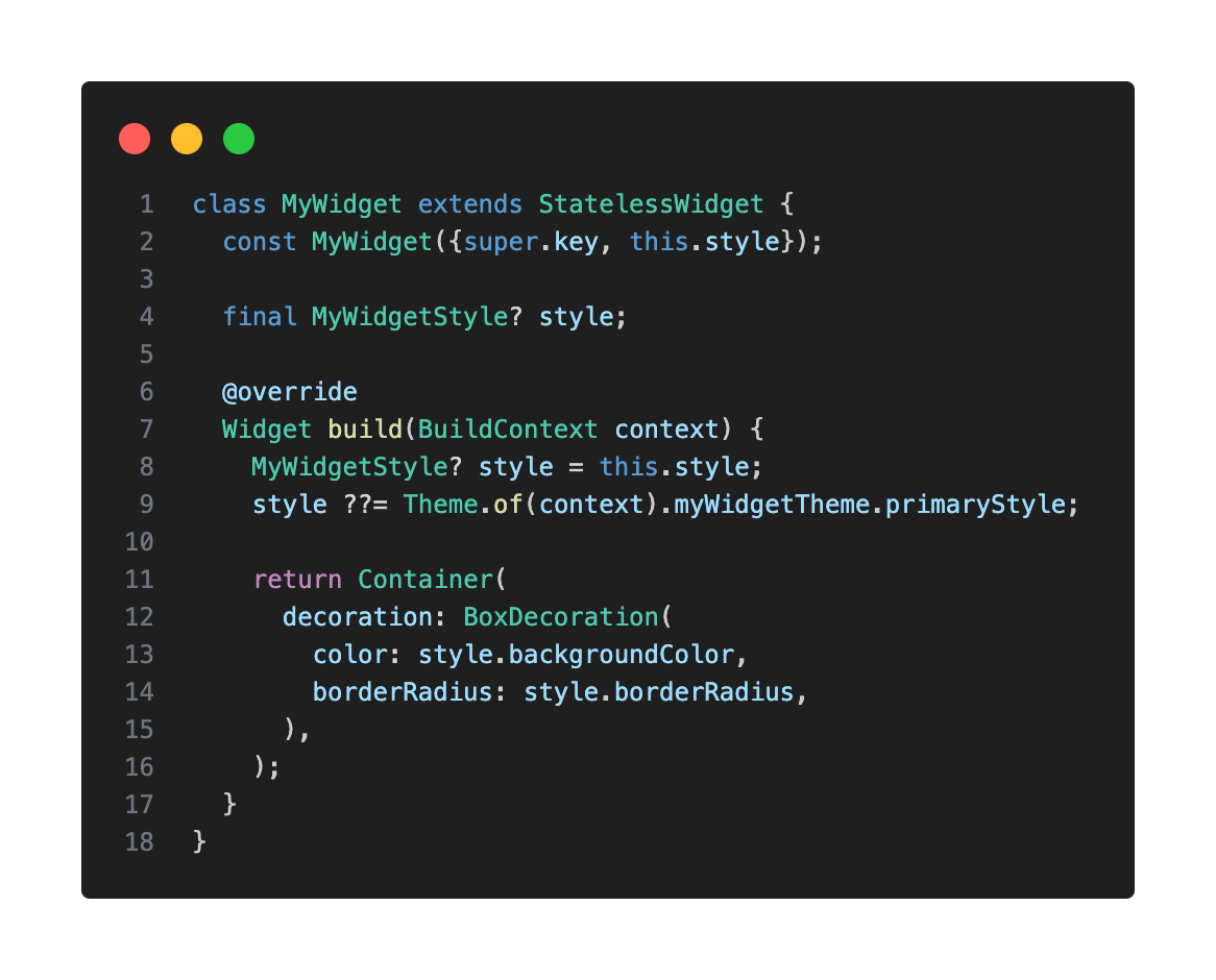
You can then pass an instance of MyWidgetStyle as a parameter to your custom widget.
Theme Extensions: Integrating Custom Styles Into Your App Theme
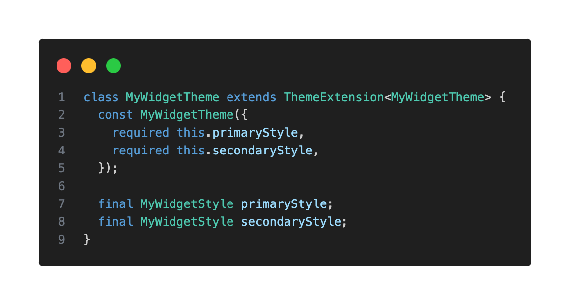
To truly integrate your custom widget styles into your app’s overall theme, I highly encourage you to use ThemeExtension. This powerful feature allows you to extend the ThemeData class with your own custom styles, providing a centralized and reusable way to manage them throughout your app.
Here’s how to create a ThemeExtension for your MyWidgetStyle:
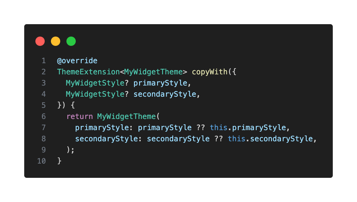
Override copyWith() to allow updating specific properties of your extension without redefining the entire object. This enables the ability to change any of the properties of the existing class, allowing for easy modifications.
Also override lerp(), which is used to interpolate between two style instances—useful for animated theme transitions like switching between light and dark mode. In Flutter, many properties beyond colors can be “lerped,” such as shapes, decorations, and text styles. This method is vital for providing a polished user experience during theme transitions, for example, when animating between light and dark mode.
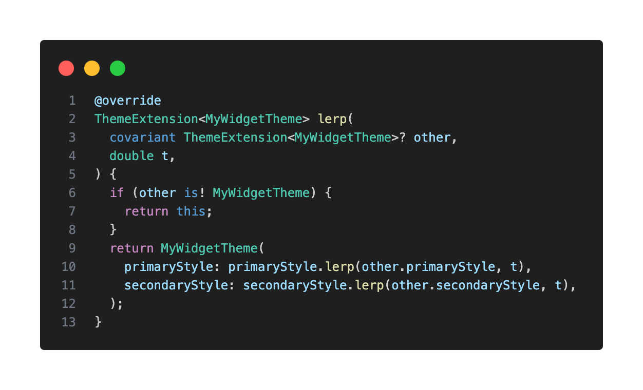
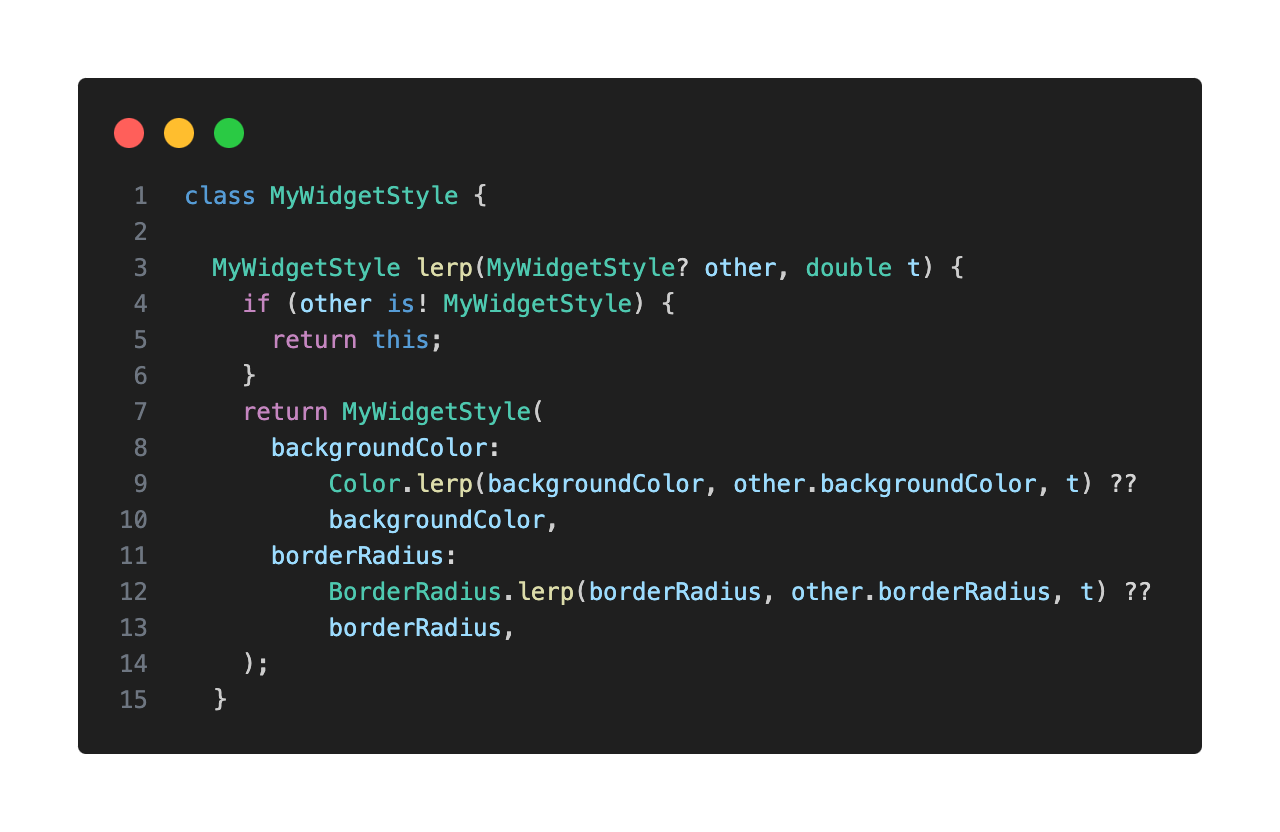
You will also need to create a lerp method in your style class to then use in your extension:
Adding Your Theme Extension to ThemeData
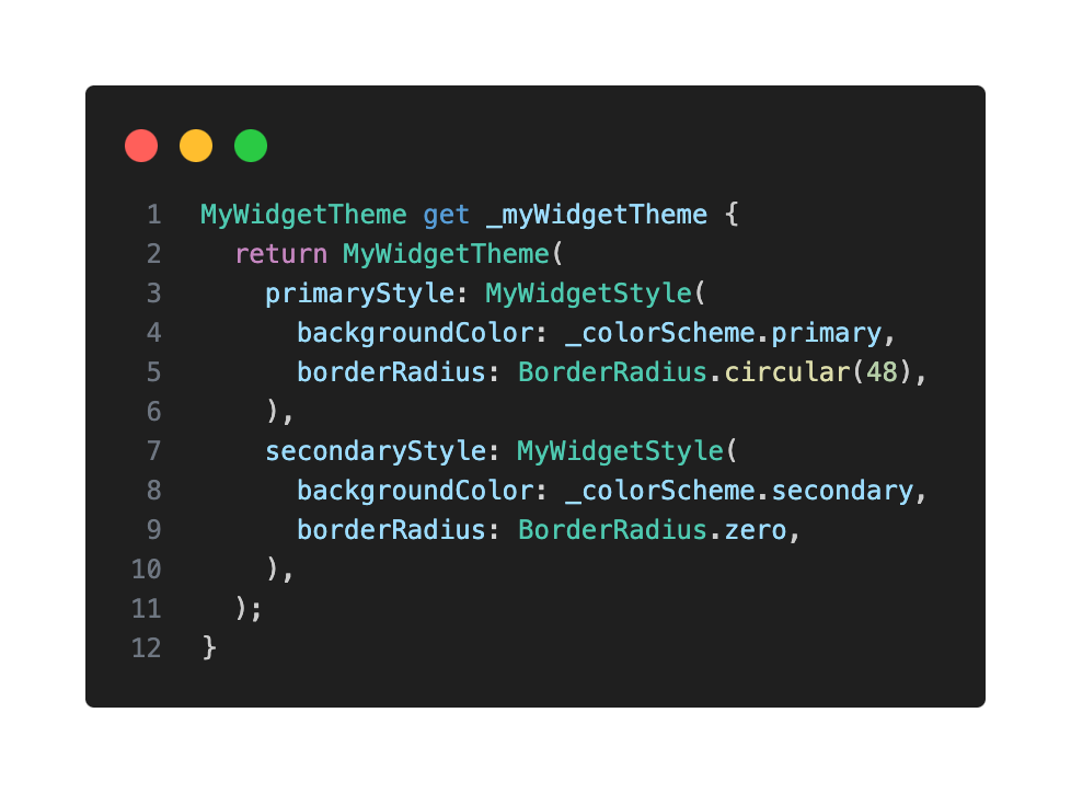
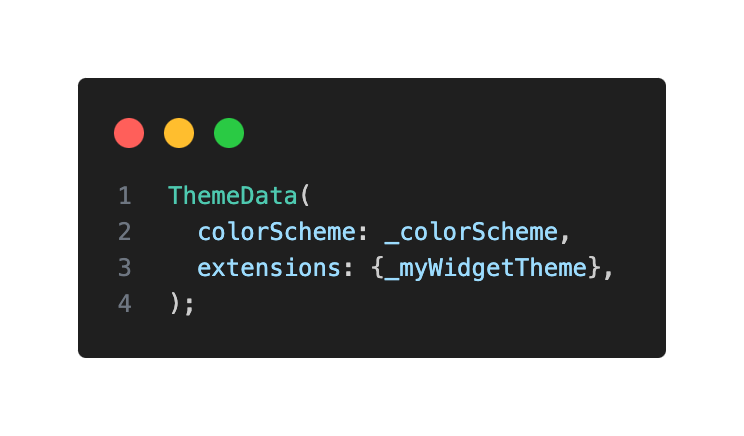
Now, you can add your newly created MyWidgetTheme extension to your ThemeData.
Accessing Custom Themes in Your Widgets
To access your custom theme extension within your widgets, it’s good practice to create an extension on ThemeData. This allows you to call your custom theme extensions as if they were any component theme and also handles null checks in a single place.
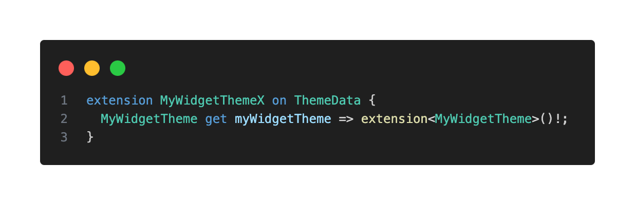
Now, in your MyWidget, you can easily reference your custom styles:
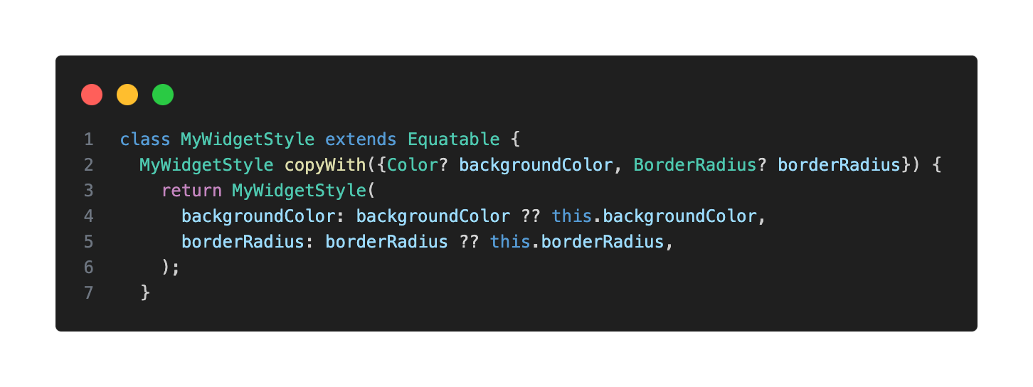
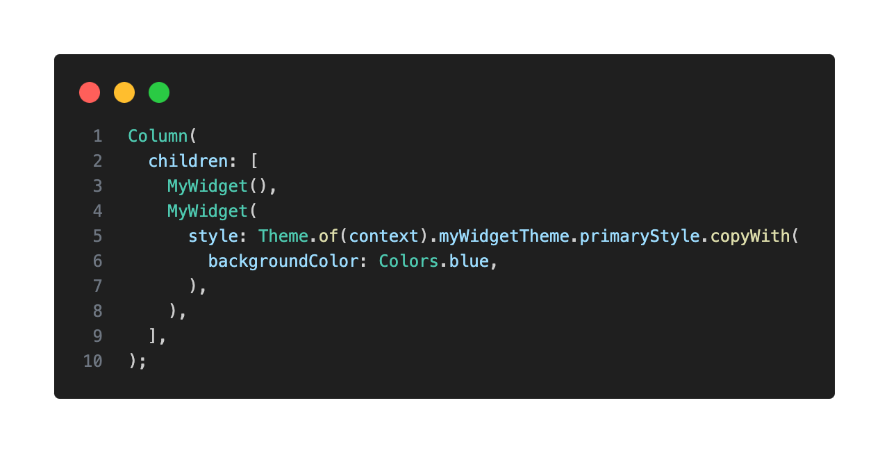
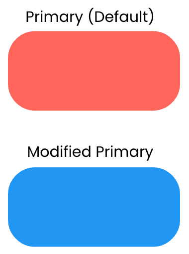
Modifying Styles With copyWith
I also recommend defining a copyWith() method in your MyWidgetStyle class, as it’s incredibly useful. It allows you to create a copy of a particular style while changing only a few properties, without redefining the entire style. This is handy for situations where a style is mostly the same but needs slight modifications.
Handling Widget States
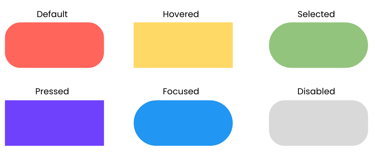
What if you want a widget’s style to react to state changes, such as being pressed, hovered, or disabled?
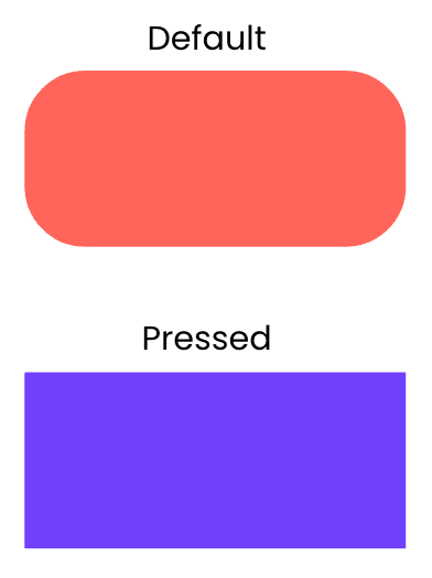
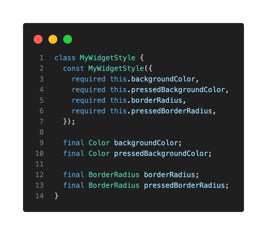
You could add more properties to your style class (e.g. pressedBackgroundColor, hoveredBackgroundColor).
But this quickly becomes unmanageable for multiple states and properties.
Function > Static Value
Flutter offers a solution: instead of using a static value (e.g. for backgroundColor), you provide a function that returns a value based on the widget’s current state.
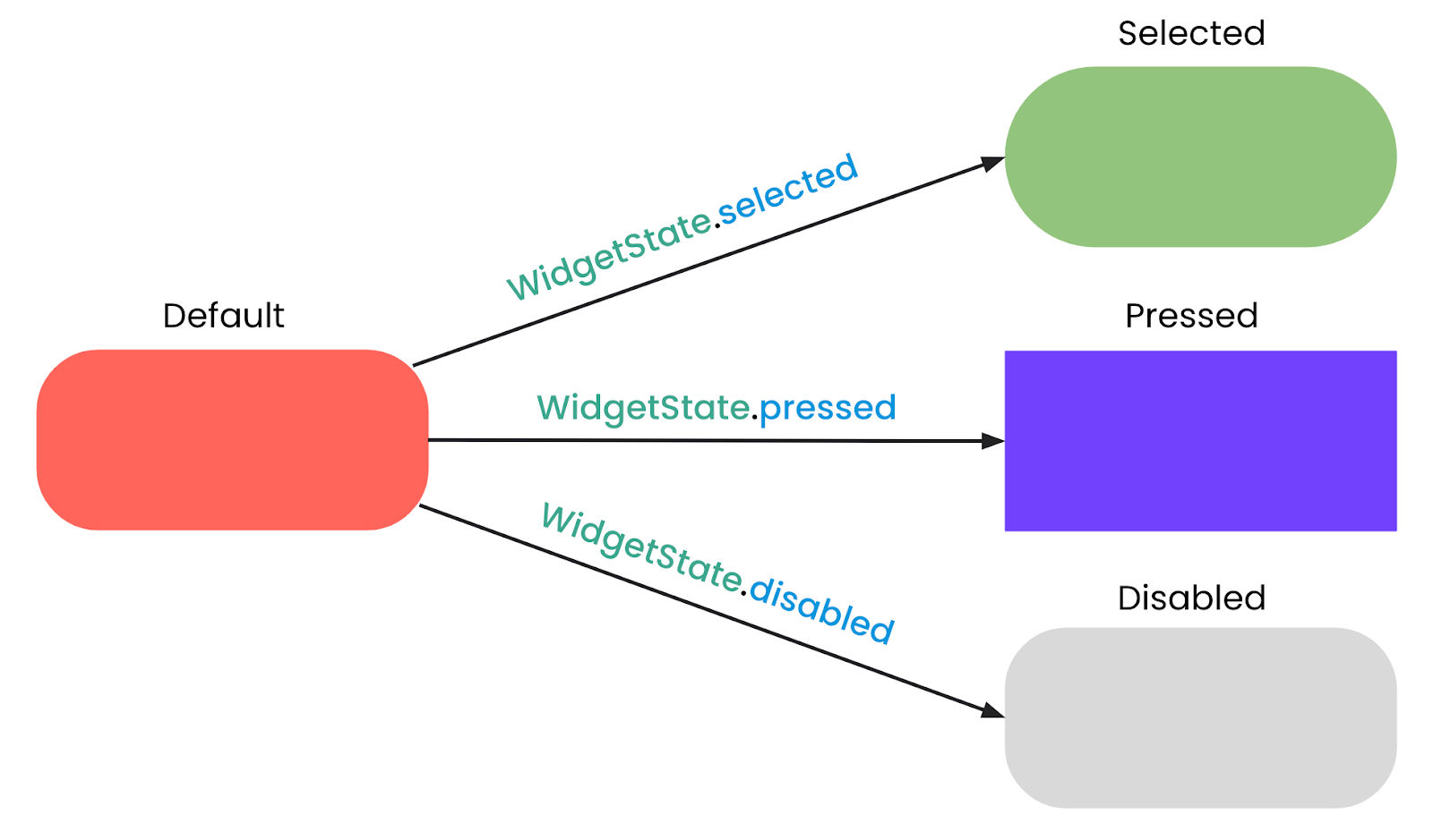
Before diving into that solution, let’s understand what Flutter refers to as WidgetStates. A WidgetState is an interactive state recognized by the Material Design Library (but not limited to it) that includes states such as pressed, hovered, focused, or disabled.
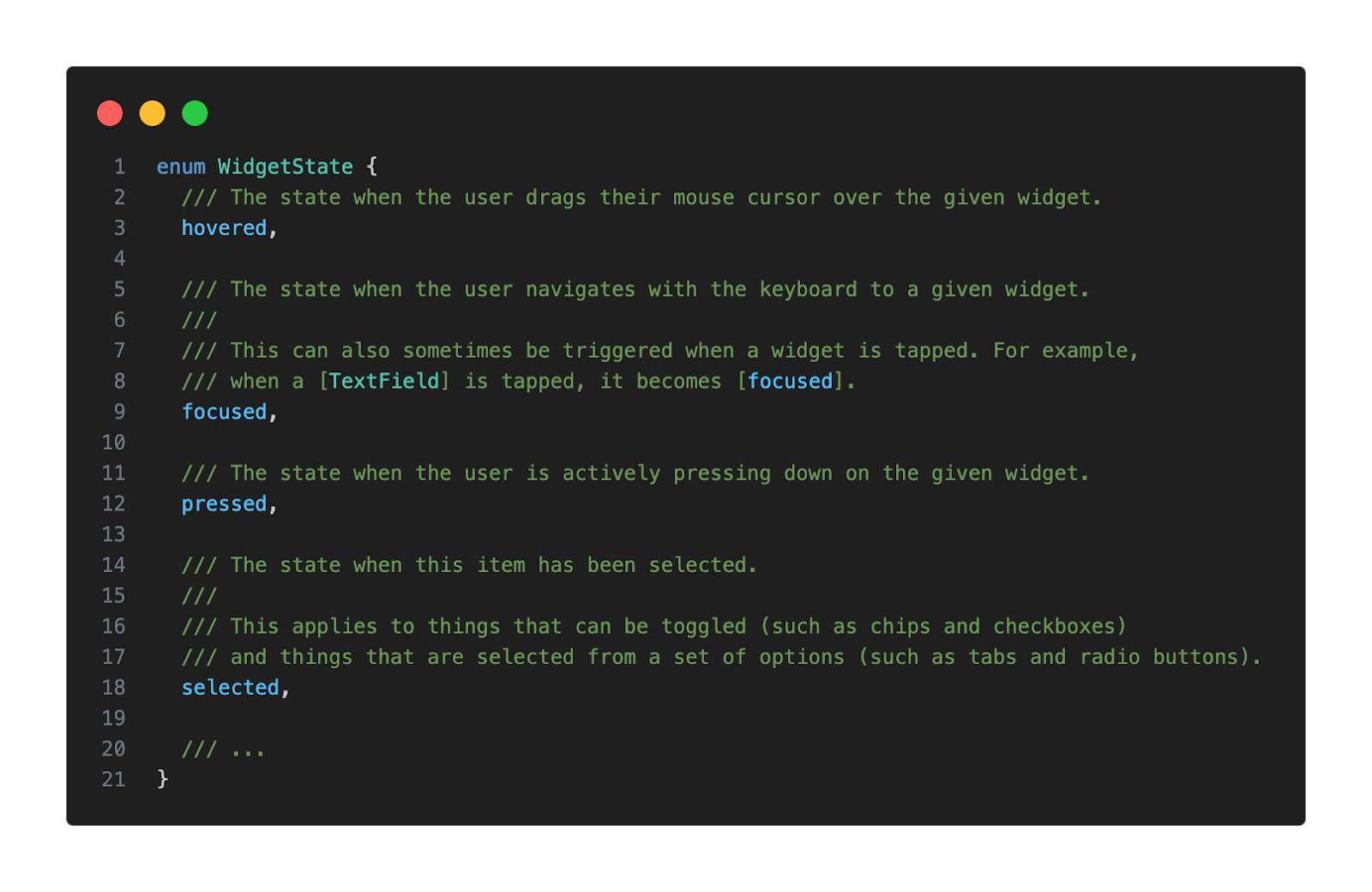
Now we’re ready to dive into that function I mentioned earlier, WidgetStateProperty, which is actually a specialized class in Flutter’s framework that allows properties to resolve to different values depending on a widget’s state. This is particularly useful for styling widgets so they can visually respond to user interactions or changes in their state.
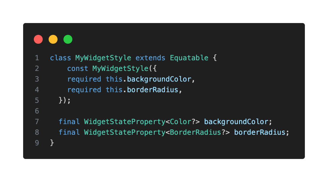
Updating Your Style Class for WidgetStateProperty
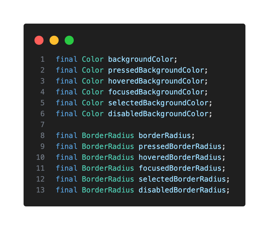
We should use WidgetStateProperty when the style of our widget depends on different WidgetStates. This avoids polluting the style class with multiple members (e.g. disabledBackgroundColor, selectedBackgroundColor) and centralizes the stylistic logic within the style definition, rather than scattering it in the widget’s build method.
Instead of static values, your style properties will now accept a WidgetStateProperty.
Resolving Widget States in Your Theme Extension
In your MyWidgetTheme, you’ll define how each style property resolves based on the provided WidgetStates set using the resolveWith method.
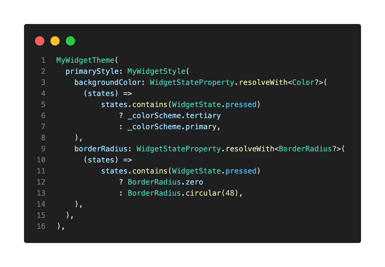
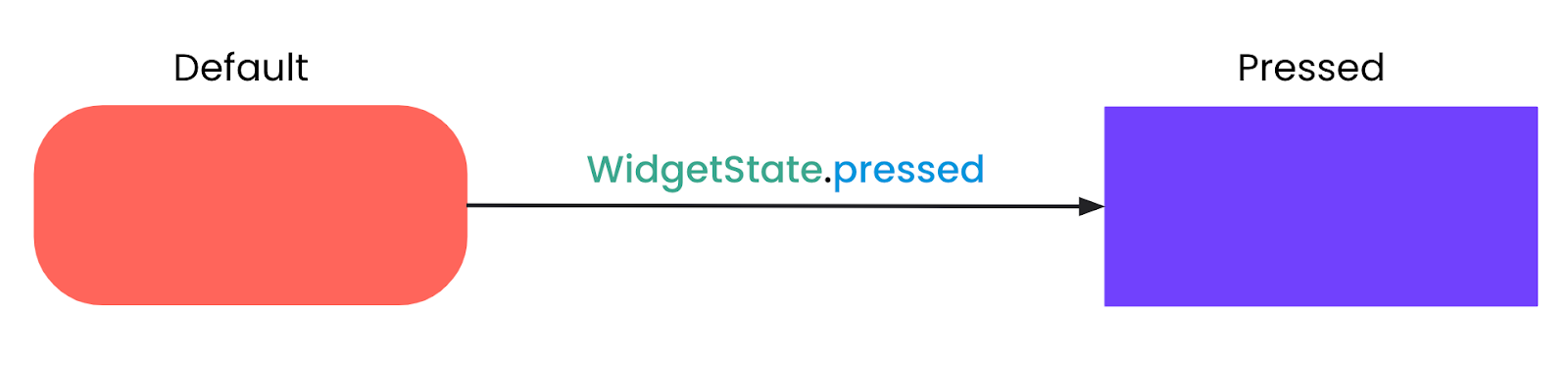
This setup will allow our widget to change its appearance whenever it goes into the pressed state.
But it can be modified to support different styles for any WidgetState: selected, pressed, disabled, and more.
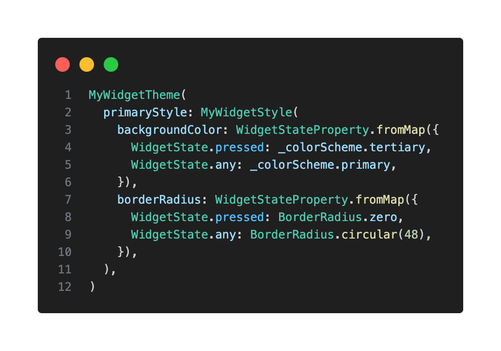
You can also use the fromMap method for a more readable way to define state-dependent values:
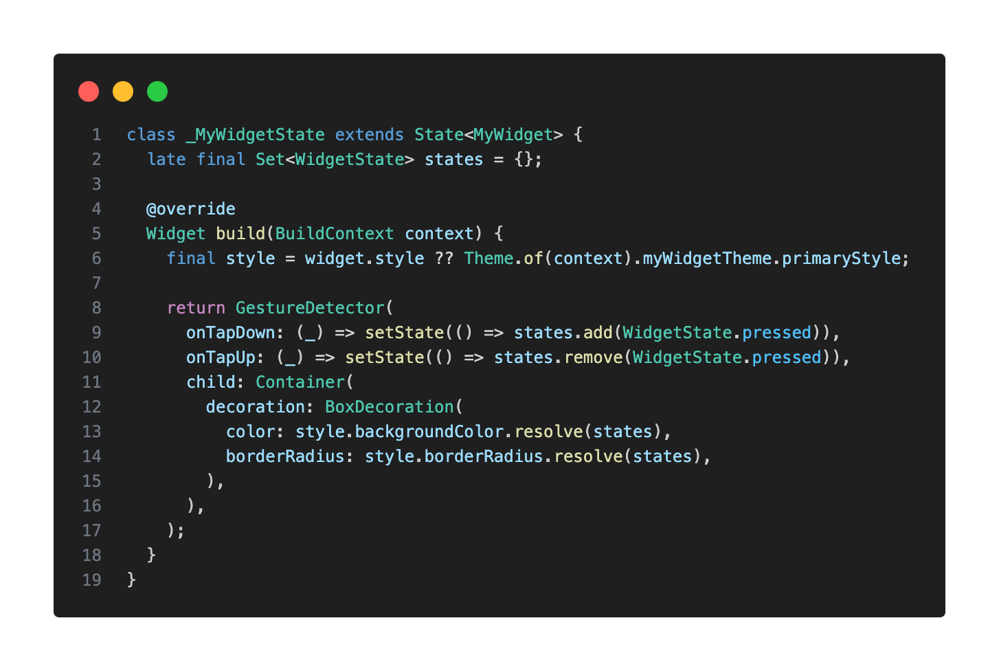
Tracking Widget States
When using WidgetStateProperty, you need a mechanism to track your custom widget’s current WidgetState. One way to do this is by having a Set
In my case, since I want the widget to respond to taps, I wrapped it in a GestureDetector. Then, onTapDown the pressed state gets added and onTapUp gets removed.
Then, using that set of states, we call .resolve() on the relevant style properties to determine the correct style (e.g. color or border radius).
Final Takeaways
Flutter’s theming system might seem a bit daunting at first, but I truly encourage you to experiment with it and leverage its power. It’s an incredibly valuable tool for any developer’s toolkit.
The MaterialApp provides a highly opinionated, yet remarkably flexible theming foundation. When building your own custom widgets, strive to mimic that established behavior. This philosophy, of aligning with the framework’s approach (while tailoring it to your needs, of course), will help create a cohesive and maintainable codebase.
Working on a Flutter project with a robust theming system genuinely elevates your daily development experience. Not only does it simplify the separation of concerns—allowing you to focus on either appearance or behavior independently—but your custom widgets will feel seamlessly integrated into the ecosystem, making them intuitive to use and style.
Please note that I delivered this talk in both English and Spanish. If you’d like to watch them, you can find the recordings here: Fluttercon USA & FlutterConf Latam.
Do you have any specific custom widgets in mind that you’d like to theme, or perhaps a particular design challenge you’re currently facing? I’d love to hear about it. Feel free to reach out, and let’s chat!


